Website Redesign
Improving the user experience
for Bike Austin members
Bike Austin is a non-profit organization who's goal is to grow bike transportation in Austin in order to improve the communities' quality of life. The problem is that their website is very difficult to navigate and the important things they want to share with the public are getting lost in a maze of pages and a convoluted information hierarchy.
We met with Bike Austins' stakeholders and members to find out what they wanted to see on the website and what was most important for them to have easy access to on the Bike Austin website.

Working with a team of 4 to design this project, my roles included;
-
Designing the Hi-fi Home Page and Board of Directors pages
-
Conducting User Interviews
-
Synthesizing Data into a User Persona
-
Sketching Wireframes
-
Conducting A/B User Testing
-
Designing the Style Guide
-
Coordinating Meetings with Stakeholders.
Understanding the Problem
Now Lets Take a Look at Their Current Website
We reviewed their website and red lined all the issues that we felt were potential problems. There were quite a few issues, but some of the main issues that we thought were a priority to improve included:
-
Multiple navigation options make it difficult to find what you are looking for.
-
Menu options with different names, take you to the same page.
-
Some menu options seem like they should take you to a particular subject, but they don't.
-

-
Information Hierarchy Needs to be improved
-
A lot of duplication of information on different pages /Some information seems out of place.
-
Fonts are all similar in size, it's hard to pull out key information at a glance.
-

Research
The Stakeholder's Needs

Next we interviewed the stake holders to find out what they wanted to see improved on the Bike Austin website.
The top 4 most important improvements to the website that they wanted to see included:
-
Update the Navigation and improve the information hierarchy
-
Make sure the Education page is easy to find and easy to follow
-
Add events to the home page so members can get involved
-
Enable users to easily donate or learn ways to volunteer
The User's Feedback

Interviewing cyclist and sending out a survey to current Bike Austin members gave us the following insights:
-
50% of respondents felt that they don't really know the bike laws and regulations well.
-
6 out of 7 people surveyed felt that the layout of the Bike Austin website could be improved.


"There used to be pages that had rides and descriptions, which I found very useful. I would love to see these front and center again."
"It can be hard to find event information."
"Menus could be more accessible and easy to navigate deeper."
Checking out the Friendly Competition
I did a sweep of some not-for-profit organization websites to see what they are doing well and what we could do better. Below is a snapshot of our findings.

Analyzing the Data
Using Miro, we organized all of the feedback we gathered into an Affinity Diagram.


Again, we saw the same 4 issues with the site that needed to be resolved:
-
The navigation is difficult to follow
-
Educational information is something users want to see and use
-
Social Events are important to see and find easily on the site
-
Donating and volunteering needs to be easily available to the user
Next we developed a User Persona based on the user interviews and the survey.
Meet Our User
Schwinn McGears
Enjoys riding bike with her kids
Tells friends and family about Bike Austin
Mom of 2 young children
Wants to promote bike safety, health and a Green lifestyle
Rides her bike when she goes on errands
Female, 38 yrs
Next We Empathized
Says:
-
"I wish there were more safe bike lanes in Austin."
-
"Riding a bike is a great way to get exercise and reduce your carbon footprint."
-
"I want my children to learn how easy it is to ride their bicycles around town."
Does:
-
Rides her bicycle to the farmer's market.
-
Takes her children on fun rides.
-
Partakes in Bike Austin's events.
Schwinn's Pains Include:
-
Isn't always sure where to go to find Bike Austin's event information.
-
Frustrated when trying a new bike route. Wishes that there were better maps to follow.
Thinks:
-
The information on the Bike Austin Website is good, but difficult to follow and find.
-
Advocating for safer bike routes is very important.
-
Austin could become a major bike friendly city.
Feels:
-
Frustrated when there isn't a safe bike path.
-
Excited that Bike Austin is trying to make a difference.
-
More cyclists is good for Austin's pollution reduction.
Schwinn's Gains Are:
-
Safety: Excited when cyclists and drivers are well informed about cycling laws and safety.
-
Family time: Wants her children to feel excited about riding their bikes.
Making it All Make Sense
One of the main issues we uncovered that needed to be improved, was the Navigation. The information on the website was hidden in 3 separate Nav bars, making it difficult for users to find what they were searching for.
Users reported that looking for Bike Austin events was challenging for them to find. "It can be hard to find event information." Which is also a main issue the Stake holder's brought up.
To fix this issue, we did some Open & Closed Card Sorting. Below is how we finalized on how to structure the Navigation, in 1 main Nav bar.

Going with the Flow
In order to start our designs, we had to develop the user flows. We wanted to make sure that the user could easily find all the information that they were looking for, in a stream lined flow.
About - User Flow
All information About Bike Austin is nested under this drop down menu.

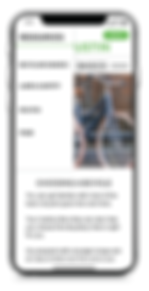
Resources / Education - User Flow
The resources flow includes all bike information related to laws, safety, tutorials and bike routes.

Events - User Flow
The events flow lets you see all the event related materials under one menu.

Get Involved - User Flow
It's important to drive traffic for users to donate and/or get involved. This user flow allows the user to donate easily and sign up to volunteer.

Analysis
Prioritizing the Data
We then created a MoSCow to prioritize what improvements and changes we were going to make on the Bike Austin re-design.
MUST
-
Events on Home pg
-
Dynamic Images
-
Funnel to join
-
Navigation
-
Advocacy
-
Education
COULD
-
Engage
-
Update Footer
-
How to 101 Videos
-
Videos
-
Delight
-
Images of B.O.D.
SHOULD
-
Events
-
What We Do
-
Accessibility
-
Newsletter
-
Bike Routes
-
Weekly Calendar
-
Mobile First
-
Social Media
-
FAQs
WOULD
-
Blogs
-
Google Analytics
-
News
-
New Style
-
Animation
MoSCow
Time to Start Sketching
Next each person in the group sketched a different page of the website. I was assigned to sketch the home page and the about pages.
The home page is where we started using the new Navigation. During development of the re-design, we felt that users would benefit from a static menu on the upper left side, every time they went to a different page. That way, they were always aware of where they were within the site at all times.

Designing & Testing
Starting the Design
Once we created our hand sketched wire frames, we then each sketched up pages for the Lo-fi prototype. We used XD to collaborate and design on the same file, which allowed us to keep the same look throughout the prototype.
Users were able to accomplish the following tasks that we asked them to:
-
How would find an event and its details on the Bike Austin website?
-
Where would you go to find the contact information of one of the Board of Directors?
-
How would you find out about bike laws in Austin?
Some User Feedback during testing included:
“For me the layout is really nice [...] It feels comfortable.”
“The site was really easy to navigate."


A/B Testing
Once we created our hand sketched wire frames, we then each sketched up pages for the Lo-fi prototype. We used XD to collaborate and design on the same file, which allowed us to keep the same look throughout the prototype.
In addition, we conducted A/B testing on the Lo-fi prototype with users to get their thoughts on the initial stages of the design.


While designing our Lo-fi prototype, we came across an opportunity to make the navigation even more understandable for the user. We felt that having a static menu on the upper left corner on each page, made it easier for users to figure out where they are on the site.
Version A: With Side Menu
Version B: Without Side Menu


100% of users tested preferred Version A, with the side menu.
"Its helpful to me, even if I don't click on it."
"Its already telling me what's on the page without having to scroll down."
"Everything is easily accessible."
Testing & Analysis
Design
The Style Guide
Once we tested our Lo-fi prototype and found out that the version with the side menu was what users preferred, it was time to design the Hi-fi prototype. I created a Style Guide based on Bike Austin's pre-existing style guide in order to keep their branding and aesthetic consistent with the their brand.
In order to do this, I utilized the same palette, fonts, logos, icons and imagery.
I designed the buttons and forms to have rounded corners, to draw the users' eye to them.

Accessibility Testing
I also tested the main color combos for color Accessibility, to make sure that every user can easily read all of the content.


Going Hi-fi
From there, we used XD and worked together to create the Hi-Fi prototype of Bike Austin's website.
We made sure that the site was responsive, so we designed a mobile version first.


Home Page Improvements
Below are callouts of the updates we made to the Home Page, based on user feedback and the Stakeholders' needs.
-
Simplified Navigation
-
Educational now grouped into "Resources" also has a Biking 101 video on the home page.
-
Social Events are right under the Hero image, so they are easy to find.
-
Donating and volunteering CTA buttons are easily accessible
One easy to follow Navigation Bar
Call to Action to donate

Getting Involved
on home pg
Advocacy Easily Accessible
Events on home page
Education
on the
home pg
Secondary Page Improvements
On the secondary pages, we added a static menu on the upper left hand side of the page. This feature was appreciated by 100% of the users we tested.
We also created a consistent look to all the secondary pages, with a hero image at the top and its corresponding text.
Calling out location

Consistent
Layout
Static Nav
Calling out
location
What We Learned
.png)
A few of the lessons we learned while re-designing Bike Austin's website included:
-
Having multiple menus and ways to navigate a website can be confusing
-
Sometimes, less is more
-
Knowing the User's priorities when visiting a website is important when designing
-
Explaining a decision to a stake holder with data is very helpful