E-Comm Re-Design
Making online food customization and ordering, simple and intuitive for users.
Everyone loves Torchy's, Austin's favorite Taco restaurant, but their e-comm site makes ordering food and checking out confusing to users.
I was part of a team of 6 that had 4 weeks to research and design a simplified and intuitive e-comm food ordering and checkout process for Torchy's, under the pseudo brand, "The Devil Made Me Do It", a Vegan Food Truck.

My role included:
-
Designing the HiFi responsive desktop prototype
-
Developing the check out flow
-
Designing the style guide
-
Testing for accessibility
I collaborated on:
-
Conducting user interviews
-
Sketching wireframes
-
Conducting A/B user testing
Our goal was to create a fully customizable, intuitive checkout process, for Torchy's pseudo brand 'The Devil Made Me Do It', a Vegan Taco Food Truck, that gives customers a stress free and easy way to order food online. So we needed to discover who our Vegan user was and how a they would order food on a website.
The Goal
How Torchy's Website is making the ordering process difficult for users
Research
In order to get an idea of how we could make "The Devil Made Me Do It" ordering process better than Torchy's website, we analyzed the Torchy's checkout process and redlined what they were doing well and what could be improved.
Below are the main points that we felt were important to adjust and apply to the check out process for "The Devil Made Me Do It" website.

Navigation should be here
-
Proximity - Buttons are also too far from the area they are related to
-
Hierarchy is not Clear - Menu should be in the top Navigation
-
Task Efficiency - Add ability to adjust quantity
Competitive Analysis
Once we pin pointed the main issues of Torchy's check out process, we wanted to see what other plant based restaurants are doing on their e-comm websites. This gave us insight into what they are doing well within their online ordering services and what we can do to make our spin off vegan food truck "The Devil Made Me Do It", online ordering process better.


P. Terry's- Credit card information checkout error call out
Sundaze- Full Screen Navigation, Easy Auto-fill Checkout
The Vegan Nom- Customization pop up cards
Chipoltle- Ingredient cards used when customizing order
User Surveys

In order to gain an idea of who our Vegan customer was and what a Vegan user looks for when ordering food online, we reached out to the Austin Vegan Facebook Page to receive their feedback.
We received 108 responses to our online survey which asked about Vegan food habits when eating out and ordering food online. Some highlights from the data we drew from their responses included;
-
The majority of the respondents are female and between the ages 25-40.
-
65.2% of respondents eat vegan because they care about their impact on the environment.
-
They also try new restaurants based on positive reviews by other vegan's.


User Interviews
Now that we had some quantitative data from the survey, we next interviewed potential users for some qualitative data. During these interviews, we asked questions about their experience of being vegan as well as questions about ordering food online.
Below are some key quotes that gave us a deeper understanding of who our user was and who we were designing for.

The User
After synthesizing all of the data we collected, we developed the ideal user for "The Devil Made Me Do It", A vegan taco truck eComm site.
Jenny Love, 30
Says:
-
"I miss eating the non vegan foods that I used to eat."
-
"Ordering food online is convenient, but it never comes out right."
Does:
-
Uses social media as the primary way of discovering new vegan restaurants.
-
Orders food directly from restaurant.
Jenny's Pains Include:
-
Social Pressure: Eating with groups of Non-Vegans
-
Restriction: Wants to feel like restaurants have more options & that she has the freedom to customize her order.
Thinks:
-
There is such a stigma associated with being a vegan.
-
Austin is the perfect city for trying out Vegan food truck businesses.
-
Eating out with friends is challenging.
Feels:
-
Frustrated when eating out at non vegan restaurants.
-
Judged negatively by her vegan lifestyle.
-
Excited to try new vegan restaurants.
Jenny's Gains Are:
-
Discovery: Loves finding exciting, unique & innovative vegan places.
-
Comfort: Likes restaurant experiences that meet her diet restrictions in a comforting & inciting way.
The User's Journey
We wanted to get an idea of what Jenny's experience would be like while using "The Devil Made Me Do It" responsive website, so we mapped out her user Journey.
We utilized the user journey when designing and developing the wire frames. We made sure to include all major touch points of the user experience and how the user will feel during their "journey".

The Problem Statement

Jenny is a young-professional with a plant-based diet that needs a convenient, trustworthy and satisfying option for ordering food online.
During our research we discovered that Torchy’s does not offer any vegan options or ways to tailor orders online. We also learned vegans often feel judged and uncomfortable when requesting custom orders to fit their dietary needs.
By creating "The Devil Made Me Do It", a vegan Torchy’s spinoff brand, with a fully customizable, intuitive checkout process we give customers with a plant-based diet a safe space to feel confident and at ease about ordering food online.
User Flows
Going with the flow
We created 3 key user flows, based on the stakeholder's requirements.
Login Flow

-
Create an Account
-
Save Payment for future Use
-
Save favorite/past orders
Purchase Flow

-
Search items in menu
-
Customize selected items
-
Add items to cart
Checkout Flow

-
Proceed to cart to check out
-
Verify order
-
Add payment info
-
Confirm Order
-
Pay
-
Error Notification
-
Correct Error
-
Order confirmation
Design
Putting pen to paper
Next, each of us sketched our own wire frames. We reviewed them as a team and combined ideas to create the best possible user experience.

Impactful Improvements
Through our user interviews and surveys, we felt that the following 3 tasks were important to include for a great user experience. We added them to our wireframes in order to test them
early on in the process.
-
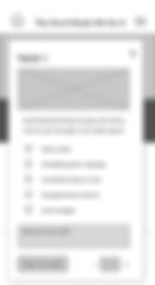
Item Customization Cards
-
Estimated Time Order is Ready
-
Customer Feedback
-
Vegan/Environmental Facts


Vegans often use social media to
share their experiences at restaurants. We wanted to give them the option to give feedback right away, before sharing it on social media.
We also wanted to give them an
estimated time of pick up.
When vegans order food online,
their order often comes incorrect or with non-vegan ingredients.
Giving the user the opportunity to specify the ingredients, helps to clarify and confirm that the order placed will be correct.
A lot of the users stated that the reason they became vegan was because of the environmental impact that eating meat causes.
We wanted to give the users a vegan fact that would let them know how their purchase made a difference.
The Style Guide
The stakeholder requested that the new site have the same fun and "devilish" feel as the original Torchy's website. After reviewing the Torchy's website, I created a style guide utilizing their color palette, fonts, similar buttons, icons and imagery.

Design
Accessibility
I tested all the color combinations we planned on using for accessibility and all of them passed. I also checked the Torchy's website for alt text on images and a screen reader, however they did not have either. We planned to add both to our site, so that everyone can place an order on The Devil Made Me Do It website.


Preliminary Prototype
Once we were happy with the UI elements and styling, we sketched up the Hifi prototype. We wanted to make sure that the website was responsive, so we designed the mobile first and then the desk top version.


Testing & Analysis
User Testing
Through our design process, we felt that there were some elements that our user would like to see. To prove our theory, I designed 2 versions of the desktop site and tested both versions, to find out what the users preferred. Check out the testing results below.
-
We knew the user would want to know how their purchase reduced their environmental impact. So we tested two different locations for vegan/environmental facts. The users felt that the Environmental Vegan Facts were more impactful at the end of ordering, then during the ordering process, because they were more focused on ordering that they didn't notice the facts at all.


“I was paying more attention to my food order than the Vegan Facts.”
-User
-
The consensus was that the Environmental Vegan Fact was more impactful when we added it to the Confirmation Page.


-
At some point in the order/check out process, we needed the users to create an account, for future orders. We just weren't sure when the users felt most comfortable creating a user account. So we tested one option where the user created their account before they created their order and another option where they created their account at the end of the order, before paying. It turns out that users preferred to create their account as they were checking out vs before adding items to their cart.

“I don't like to create an account before ordering.”
-User
-
Our stakeholder wanted a little friction at check out, just to make sure that user double checked their order more than once, so that they could make sure their order was correct. The felt that there was too much friction when confirming their order. They commented that seeing a confirmation page twice was enough.

“I don't need to see the order again because I already confirmed it twice.”
-User
We also tested for the visual look and feel of the Navigation and Home page design.

Version A
Version B

User's hands down, preferred Version A. Their reasons included:
-
They preferred the centered, clean Title and Menu
-
Really like the textured background vs the solid background
-
Liked the large CTA button

Closing Thoughts
What we learned
.png)
-
Vegan Customers, as well as non vegans, like the option to customize their order.
-
Users appreciate the opportunity to double check their order before placing it.
-
Users can only focus on one task at a time. Too much info at once can get lost.
-
Call to action buttons work well for getting the users' attention.